Current Issue

Our Partners
P3 5-6/2022 en
What Does it Mean ...
Preangling in the Printing Screen
Education Gap
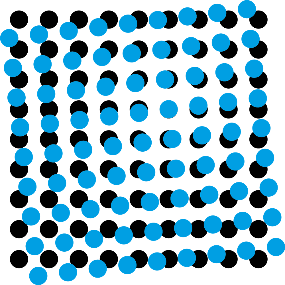
Fig. 1: Moiré between two colors.

This time, the education gap is about unwanted overlay effects in printing, so-called moirés. Ronald Weidel from the Gutenberg School in Leipzig explains concepts that can help and, in this context, illuminates the preangling in the printing screen.
Fig. 1: Moiré between two colors.
The representation of gray levels in print is technically implemented with the help of screening. To do this, the individual brightness levels of a color separation are converted into raster dots by the raster image processor (RIP). Depending on the area coverage of the halftone dot, a lighter or darker image area is created. Disadvantages of this technology are unwanted structures with minimal position deviations. Overlay effects arise, which are also referred to as interference. In the context of printing technology, this is called a moiré, see Figure 1.
Screen angling was developed to avoid moiré or actually reduce it. By angling the individual color separations, the superimposition effects are reduced so that disruptive pattern formations in the printed image are no longer recorded. Depending on the grid dot shape (e.g. round or elliptical), the available angular range is 90° or 180°. Figure 2 shows a classic angulation of a four-color set in CMYK with a round halftone dot in a 90° space. The classic rosette is in the middle.
So much for the well-known concept of screen angling, which works for the majority of printing processes. With some printing processes, however, there are other structures to consider that can have a negative effect on the printed image. This includes, for example, screen printing. In screen printing, a fabric is used as a stencil carrier. The fabric consists of horizontal and vertical threads, which in themselves create a regular structure. For example, if we use the standard screening as shown in Figure 2, overlay effects will inevitably occur between the yellow color separation below 0° and the fabric. This effect becomes particularly visible when the fabric fineness, i.e. the thread spacing and the screen width of the printing screen, are of similar magnitudes. With reference to the low color contrast of the color yellow, the result is perhaps still acceptable. On the other hand, if the color contrast increases, the moiré caused by the fabric structure becomes disturbingly visible. In this case, the pre-angling helps. Two screen printing concepts are used for this purpose.
The first concept is based on the preangling of the raster dataset. Instead of the usual four-color angling of 0°, 15°, 45° and 75°, a pre-angle is added to each screen angling. This is usually 7.5°. This angular size results from half the distance between the first color separation (yellow) and the second color separation (magenta) in the standard angle. With a pre-angle of 7.5°, the following new screen angles result: yellow = 7.5°, magenta = 22.5°, key = 52.5° and cyan = 82.5°. Due to the pre-angling, the distances between the screen angles remain the same. Figure 3 shows that only the starting point is offset. The 0° position will be free for the fabric.
The second concept does not relate the angulation to the data set, but to the fabric. When covering the screen, the fabric is twisted by 7.5° to the frame and then glued (see Figure 4). As a result, the screen angle of the colors remains untouched and can be printed as standard. A disadvantage of this procedure is the significantly greater need for fabric when tensioning the screen.
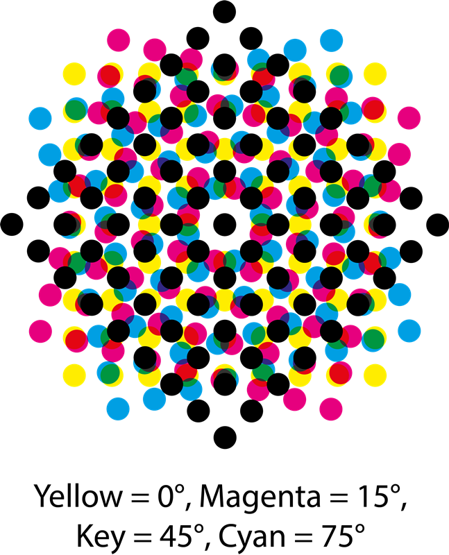
Fig. 2: Standard screen angle CMYK with circular screen dot in a 90° space.
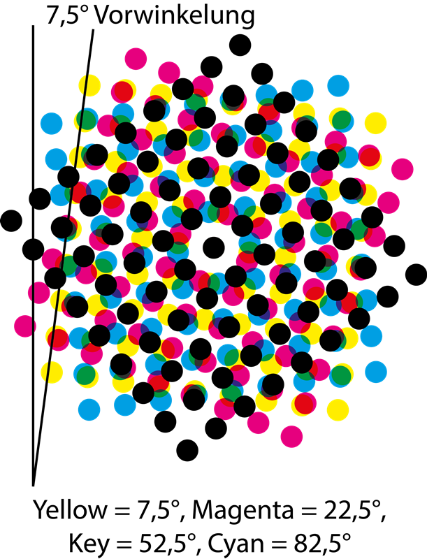
Fig. 3: CMYK screen angling with pre-angling of 7.5° with circular screen dot in a 90° space.
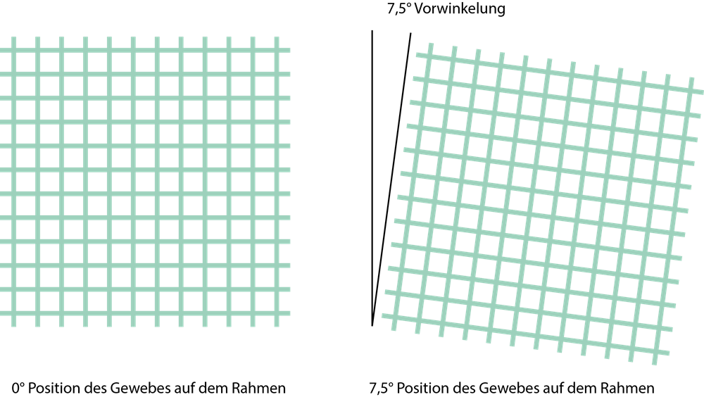
Fig. 4: Fabric angulation in 0° and 7.5° preangling.

Author and Dipl.-Ing. Printing Technology (FH) Ronald Weidel has been working at the Gutenberg School in Leipzig as a teacher for printing technology since 2008.
Author: Ronald Weidel
Editor: sbr
Images: Ronald Weidel
Content

