Current Issue

Our Partners
P3 1-2/2023 en
Mondi
Stationery
Corporate design (CD) is the fingerprint of a company.
Corporate Design With Wow Effect
Corporate design with wow effect
In order to leave a lasting impression, a company's print materials must be carefully coordinated in terms of look and feel. Colours, design elements and fonts are just as important for a professional corporate design as the surface of the paper, the printing process and the finishing technique. The interplay of these elements creates an unmistakable appearance to the outside.
Corporate design (CD) is the fingerprint of a company.
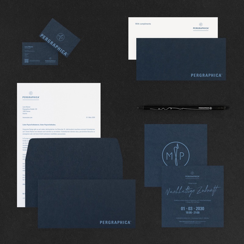
Corporate design is the fingerprint of a company: It combines all the design elements that make it unmistakable into a consistent appearance across all channels. In addition to the company logo and the claim, this also includes the fonts, colors, shapes, images and graphics used. A well thought-out physical expression of the corporate design is crucial for a consistent and convincing multichannel company presence: through print materials such as business cards, stationery and envelopes, customer brochures, flyers, giveaways and much more.
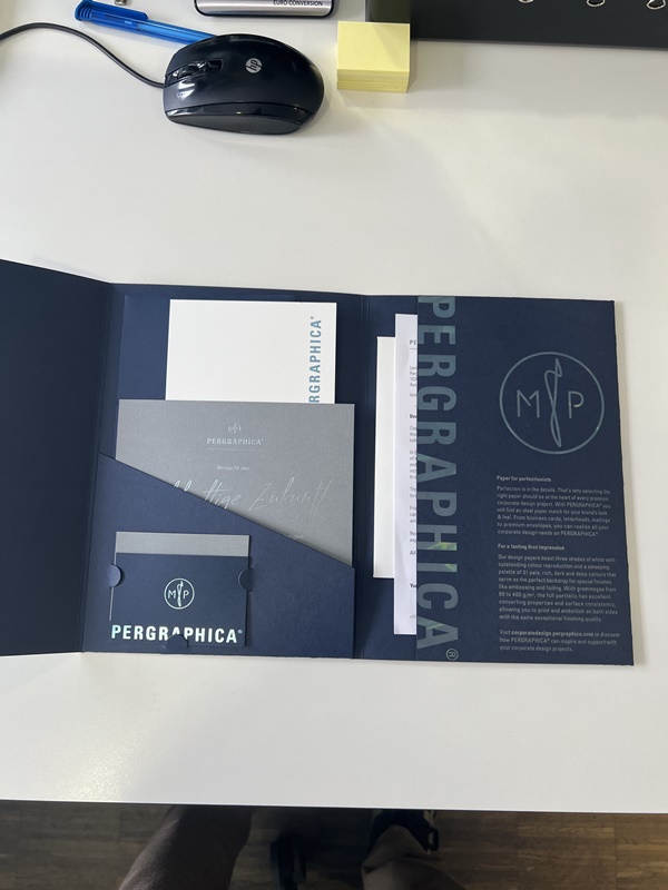
Unforgettable multichannel experiences are the domain of premium design paper manufacturer Mondi Uncoated Fine Papers (UFP). Whether creative projects or professional corporate design: Mondi UFP sees paper as the linchpin of cross-media projects and campaigns. Technical expertise in the digital design of a company's printed matter, with the right printing processes and finishes on high-quality and sustainable paper - that's the stuff unforgettable companies are made of.
Step by step to a consistent corporate design
Consistency is the key to a professional corporate design that customers and partners will remember for a long time. In order to create this consistency, the following steps have proven themselves in the professional environment:
- Research: What values and what image does the corporate mission statement convey? In which market situation does the company operate; what is the competition like? Which unique selling point should be expressed? The answers to these questions are crucial input for a suitable corporate design.
- Analysis: The findings from the research phase are discussed and condensed with the relevant stakeholders in the company in order to derive requirements for the corporate design.
- Definition of the requirements: On the one hand, the individual requirements are defined - through which framework conditions and in which applications should the company be associated through the corporate design? The general requirements for the corporate design include, above all, the desired technical properties, such as accessibility or social media compatibility.
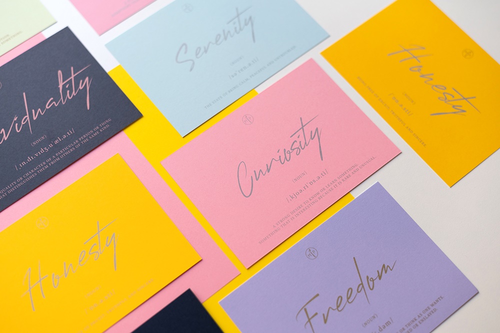
- Design: The basic elements in corporate design include the colors (corporate colors), the company logo, the fonts (corporate type), the images (key visuals) and secondary style elements and the way in which these may be used. A style sheet, style guide or brand book is suitable for documentation.
- Templates: For uniform reproducibility of the corporate design elements, these are anchored in a range of design templates - from website templates to master presentations to business card templates. It is important to match the technical properties of these templates, such as the file format, the dimensions and the color space, to the target medium.
- Training: All employees in external communication must be trained in the defined CI and the use of the corresponding templates. This ensures consistent quality in implementation.
- Brand management: A corporate design is timeless and lively at the same time. In order to take into account the change in corporate identity or current (market) trends, regular updates have been announced over the years. Feedback from customers and employees as well as market analyzes help to keep the corporate design up to date. This also includes identifying new important touchpoints for the company at an early stage and expanding the corporate design – with appropriate templates and materials – to the new channels.
Colors make companies
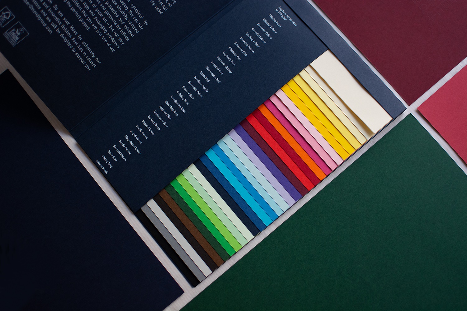
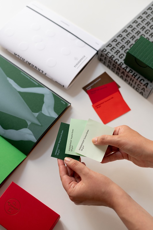
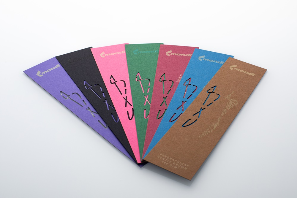
For a consistent visual identity, it is recommended to use no more than five colors in the corporate design: a dominant main color and accent colors that complement it. It is also important to note how the color works on different materials and backgrounds.
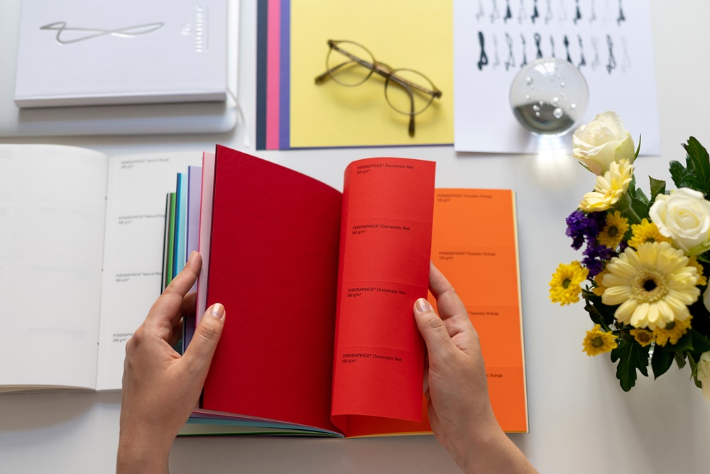
Mondi UFP offers its Pergraphica® premium design papers in three shades of white with outstanding color reproduction and in 31 soft, rich, dark and deep colors to impressively accentuate the individual color language of each company in print as well. The consistent reproduction of the corporate colors in all communication channels (digital and print) is crucial for a uniform corporate image. To do this, the color values must be defined as codes for the different color systems (RGB for web, CMYK for print, Pantone as print spot color) and documented in the style guide. Mondi UFP supports companies in the creation of a consistent corporate design not only with its high-quality premium design papers, but also with digital offerings such as webinars, design templates and ICC profiles for professional color management.
Capture image on paper
Paper is a key ally of branding. The physical experience of form, texture, even the scent of paper arouses emotions and literally adds “weight” to printed matter.
With a wide range of parameters - color, grammage, fiber structure, finishing - paper is extremely changeable and able to underline the most diverse corporate identities with corresponding tactile properties. A rough paper texture conveys a feeling of rusticity, naturalness or sustainability. A smooth texture, on the other hand, is associated with elegance and luxury. These properties are reinforced by an appropriate finish: glossy for luxury, matt for naturalness. While white paper conveys cleanliness and professionalism, beige or cream colored papers convey a sense of warmth. Even the weight of a piece of paper is interpreted subconsciously: heavier paper can convey quality and value, while lighter paper can be perceived as saving on material and thus being sustainable.
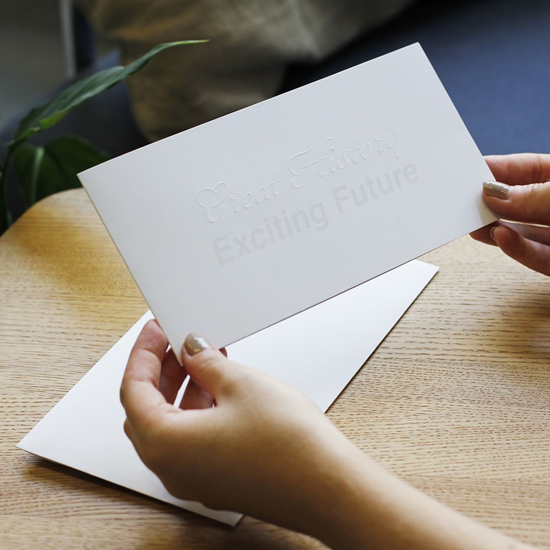
With grammages from 90 to 400 g/m2, Mondi UFP's Pergraphoca® portfolio has first-class processing properties and an even surface consistency. This means that the premium design papers can be printed and finished on both sides with the same high quality. The choice of paper can influence the choice of the appropriate printing process, with which the corporate identity becomes tangible. Experience has shown that screen printing is better suited for thicker paper and materials such as cardboard. Offset printing, with its high color space coverage, has proven itself for colorful print products such as brochures and catalogues, while digital printing is ideal for small series or personalized prints. The embossing gives printed matter a special feel and value.
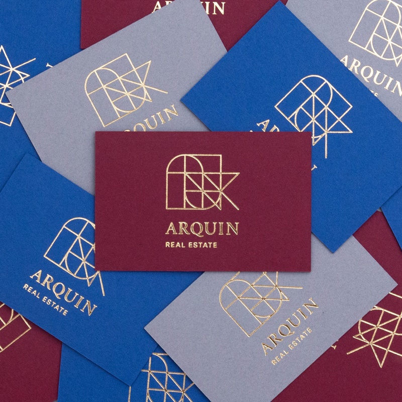
Sustainable use of finishes
Refinements such as embossing, foil lamination or paintwork can emphasize special elements of the corporate design and enhance the appearance. Luxurious effects can be created with foil embossing or high-gloss finishes. Die cuts are particularly noticeable and can therefore have a strong impact. They are therefore more suitable for eye-catching, creative designs.
When choosing the finishing technique, ecological aspects and the company budget should be taken into account in addition to the aesthetic effect. The economical use of finishes can not only protect the budget, but also the environment - through easier recycling. For example, in order to recycle paper with hot foil stamping, the foil must be removable in the deinking process. Full-surface foiling is trickier than selective hot foil stamping. Embossing and deep embossing as well as laser engraving are considered to be particularly sustainable finishing processes, since no additional materials are applied here.
In the 21st century, no company can avoid the topic of sustainability when designing its corporate design. The responsibility for the environment should be visible and tangible for the target groups at every touchpoint - through environmentally friendly technologies and the use of sustainable materials. This is where Pergraphica® convinces with its extraordinary sustainability profile: The entire range is produced in Austria, is CO2-neutral, meets the strict international standards of FSC™ and EU Ecolabel and has been Cradle to Cradle Certified® Bronze since the end of last year.
CD combines all the design elements that make it unmistakable ...
... into a consistent appearance across all channels.
Colours, design elements and fonts are just as important for a professional corporate design ...
... as the surface of the paper, ...
... the printing process ...
... and the finishing technique.
For a consistent visual identity, it is recommended not to use more than five colors in the corporate design.
Consistency is the key to a professional corporate design.
Author: Bernhard Cantzler, Head of Marketing & Business Development Mondi Uncoated Fine Paper
Editor: sbr
Images: Mondi
Content

