Current Issue
Our Partners
P3 7-8/2020 en
Mondi Pergraphica
A Question of Colour
Special Paper
The demands on the paper and packaging industry are increasing continually. Designers and end customers want a high-quality product in different colour variations and with personalised finishes. Mondi has embraced these challenges, adding a coloured range to its Pergraphica design paper portfolio. Sounds simple enough, but there are years of strategy and product development behind this decision.
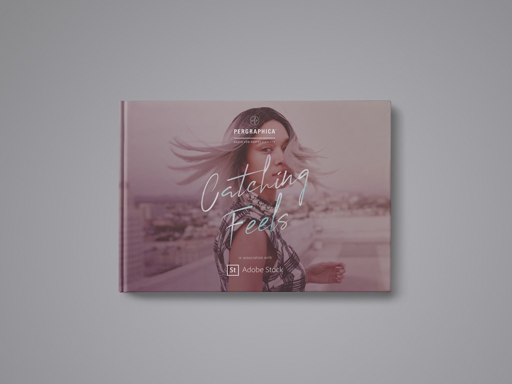
In cooperation with Adobe Stock, Mondi shows in the illustrated book "Catching Feels" the creative possibilities that modern colors and good paper quality offer artists.
What colours does the market need?
Looking at the paper market today, you can see very clear colour trends. The starting point is an analysis of the special market segment of coloured papers. Mondi has carried out surveys among marketing professionals for luxury brands, packaging providers, finishing companies, designers and premium printers, all of whom set the highest standards when it comes to paper. In the luxury packaging segment, for instance, a preference for dark and saturated colours was noted. This target group also very clearly defines the characteristics for coloured paper for these high-end applications. Colour consistency, certified sustainability and a high level of service are a given. Quality criteria for finishing, in particular folding, embellishing and direct printing, make all the difference.
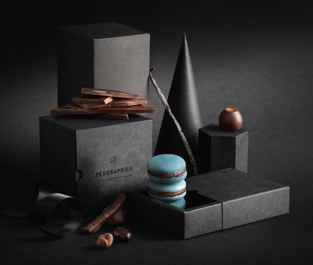
Dark colour variations for the luxury packaging market
For five years, the Mondi Pergraphica range of design papers focused on the essentials: three shades of white and two surfaces in both machine directions in the key sizes and weights. Later, an ivory paper for book printing and a black paper for creative and packaging applications were added. Last September, Mondi added 30 new, vibrant colours to the Pergraphica range, including ten so-called ‘Dark & Deep Colours’, those particularly difficult to produce, classy dark and intense shades demanded by manufacturers of packaging for luxury items. The challenge for Mondi, and indeed many other paper makers, is to make these colours withstand a lot in use without fading.
How is coloured paper made?
To produce coloured paper, dye is added at the very beginning of the process, at the point where the pulp is mixed with water, to create a mushy mixture the paper is made from in the machine. This diffuses the dye into the fibres of the pulp, creating a paper that contains colour all the way through, rather than dye just being added to the surface or even printed on. It is the only way to achieve the unique features of coloured paper, without showing white edges or revealing a white core when folding. The new shades underwent a series of stress and product tests at the Mondi Neusiedler paper mill in Austria. They were tested to confirm that they would meet the requirements of packaging material without diminishing their strength or appearance.
Safety and Sustainability
In order to ensure the smooth production of coloured paper, manufacturers need to bear a number of factors in mind. Firstly, the dye must withstand the heat and pressure of the paper machine and be consistent in the finished product. Once defined, a colour must look exactly the same in each production run. This is part of the customer promise and a great advantage of coloured paper as opposed to printed paper, which even with the best colour management can easily result in discrepancies. At the same time, the dye must be compliant with strict safety and sustainability regulations, stipulated by certifications such as the EU Ecolabel.
All Pergraphica colours are free from heavy metals and meet the strict FSC® certification guidelines. Composition is even more complex for black dye, as is the case with Pergraphica Infinite Black, which has been certified as food-safe. Even if the paper is only used as secondary packaging for a bar of chocolate, it must meet those stringent safety criteria, as there is a possibility of it coming into direct contact with a food product.
Testing, testing, testing
Verifying the colour consistency and acceptance of different finishing processes of new colours requires a number of tests. The paper is printed using offset and screen printing with CMYK and spot colours and then exposed to hot foil stamping and other finishing processes. It must be able to withstand all of this in order to convince the customer and be put into mass production.
The new colours in the Pergraphica range underwent these tests at GT Trendhouse 42, a specialist premium packaging printer based in Gelsenkirchen, Germany. Although the results were promising, even after this product development phase there is fine tuning to do, strengths to improve on and weaknesses to eliminate.
Paper creates emotion
The paper industry is a highly technical sector. When it comes to colour, however, it targets primarily creative professionals. To them, as well as the end consumer, colour is often linked to an emotion. When naming a new product range, it is therefore a good idea to not only consider clear and consistent wording, but to choose a name that can already stir a certain emotion. In packaging in particular, the right colour package can ultimately result in closing the deal. Mondi therefore decided on evocative names for the new Pergraphica colours that are nonetheless in line with the brand, such as Mysterious Blue, Precious Purple and Euphoric Pink.
Unboxing experiences to wow customers
A name alone does not make a brand, however. Manufacturers of luxury watches, perfumes and cosmetics use high-quality coloured paper in order to offer customers a haptic experience. They know that the intention to buy increases dramatically, when a customer picks up a box from a shelf that appeals to another sense, the sense of touch. They want to turn unboxing into an emotional experience that not only confirms the customer’s decision to buy, but will also look good on Instagram. At the same time, they need a reliable partner and a product whose quality has been tailored to their core applications.
Paper enables emotional experiences through the visual and haptic appeal of the paper itself, but also with its tested and verified technical qualities that enable a wide range of finishing possibilities, as finishing processes lend an additional dimension to the finished package.
The right tools
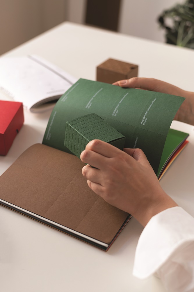
Embossing, debossing and hot foil stamping processes show the level of detail that can be achieved with the right techniques and the right paper. With laser cutting, tiny patterns can be embedded in the paper. Laser engraving is particularly suited to coloured papers, as the heat of the laser changes the colour on the engraved areas. In addition, finishing is not always just a visual gimmick, but can be a question of accessibility, as is the case with Braille. Showcasing the papers’ benefits and demonstrating possible finishing solutions requires the right tools.
In addition to a new Pergraphica Colours Feelbook, presenting the look and feel, as well as the scope, availability and properties of the new range, Mondi has created an additional marketing tool – the Wow Box. “The idea was to start with the unboxing experience and set the scene for the customer”, explains Stephanie Kienapfel, Team Lead Professional Printing Papers at Mondi. Ultimately, the Wow Box is a box full of boxes, each showcasing different colours and finishing solutions, making it possible to simply yet impressively demonstrate a whole range of different finishing techniques.
Digital and analogue
The benefit of such a high-quality marketing tool is that it really does have a wow effect on the customer; however, the costs are so high that it cannot be widely implemented.
So how do you get a tool like the Wow Box on the desks of potential customers, especially now that travel and personal meetings have been severely restricted for safety reasons? A good digital marketing strategy can help. Visually appealing products work well on video and can be widely distributed via internal sales channels. Fine papers and all their possible applications are also suitable for social media use.
But the most important element is team training, as only experts can ultimately convince customers of the product benefits. This enables professionals to discover a whole range of digital and analogue touchpoints of the new products.
Successful launch
In September 2020, Mondi launched the new Pergraphica campaign titled ‘Catching Feels’ during a virtual press conference and several customer events. The campaign was developed in a unique digital/analogue partnership with Adobe Stock. As well as the new Pergraphica Colours, Mondi also presented the Wow Box, complemented by the new lookbook targeted primarily at a creative target audience in the print and design sector. Adobe Stock and Pergraphica share many values. For instance, Adobe Stock’s motto, ‘Make Something Amazing’, is similar to Pergraphica’s ‘Creatives inspiring Creatives’. Mondi’s combined digital/analogue strategy, 'from screen to paper’, presented Adobe Stock with a great opportunity to demonstrate how the right paper can bring Adobe Stock’s pictures to life even more.
After two years in the making, the new coloured papers, and in particular the strategy behind them, must prove their worth. Stephanie Kienapfel assesses the outcome, stating that “if customer interest following the press conference is anything to go by, then the launch was indeed a great success. The emotions came across, the arguments presented were convincing.” The interaction between the digital and analogue channels and new and traditional media also went smoothly. Whether or not the paper will also sell well remains to be seen; however, some projects have already been implemented with great success.
Further information
https://www.mymondi.net/ufp/en/brand/pergraphicadarkanddeepcolours
https://www.mymondi.net/ufp/en/brand-group/pergraphica
https://www.mymondi.net/ufp/en/reference-stories/gttrendhouse
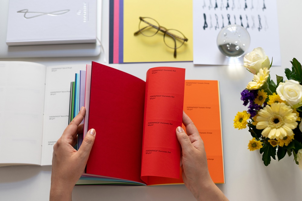
Charasmic Red, Mysterious Blue or Precious Purple: In addition to excellent quality, the Mondi experts also use evocative names to arouse emotions with their new colored paper.
Dark, saturated colors are currently particularly popular with designers in the luxury packaging segment. Elaborate embossing and engraving make the packaging appear even more valuable.
The composition of the dyes in papers that are certified as food-safe is particularly challenging. This is the case with Infinite Black from the Mondi Pergraphica range.
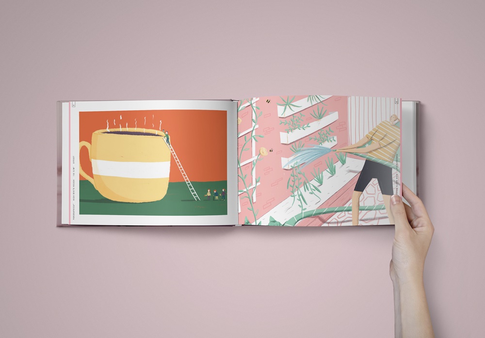
Colored papers in high quality offer the perfect basis for graphics and photographs. Pergraphica's motto here is “Creatives inspiring Creatives”.
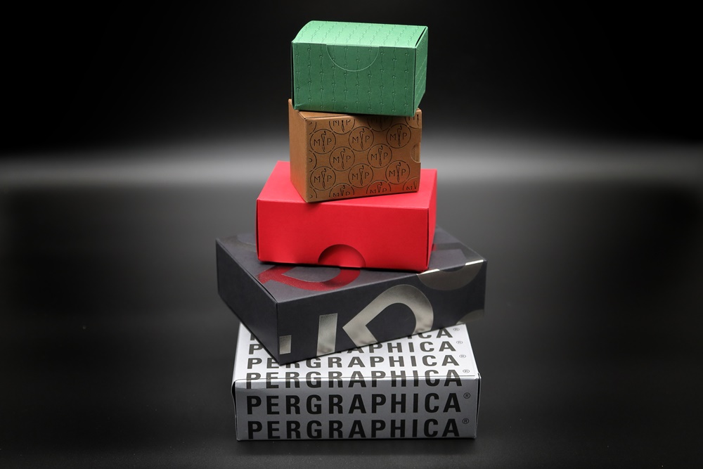
Mondi's wow box gives customers the opportunity to experience the benefits of Pergraphica up close.
Author: Markus Widmer, Team Lead Customer Experience at Mondi Uncoated Fine Paper.
Editor: sbr
Images: Mondi
