Current Issue

Our Partners
P3 3-4/2021 en
Font Design
The Ma[n]son Family
U3
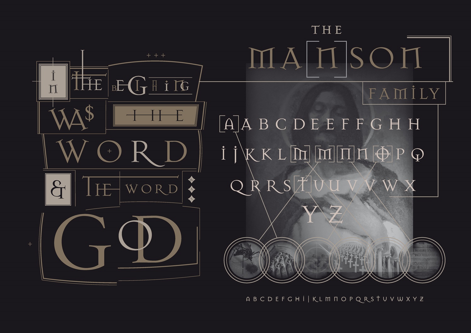
Designer Jonathan Barnbrook originally called this typeface Manson (after American serial killer Charles Manson) “to express extreme opposite emotions - love and hate, beauty and ugliness,” he has said. Its distributor, Emigre, Inc., suggested the name be changed to Mason, as the letterforms also evoke stonecutters’ work, Freemasons’ symbology, and pagan iconography.
In its design, Barnbrook said, he was influenced by nineteenth-century Russian letterforms, Greek architecture, and Renaissance bibles; the font also displays many references to popular culture, politics, and typographic history. The font was released in 1992, was kind of one of the first modern gothic fonts in the digital age and can be seen as a product of the technological and cultural influences of the time. It is now part of the Moma digital collection (https://www.moma.org/collection/works/139321).
Barnbrook: “The actual design here was for one of the boards that was in a retrospective I had at the Design Museum in London. It's normally 2A0 - see https://barnbrook.net/work/design-museum-friendly-fire/.” The font was also used for the artwork on the 1994 album “In The Hot Seat” by British progressive rock legends Emerson Lake & Palmer.

