Current Issue
Our Partners
P3 5-6/2021 en
Leipziger Typotage
Typography as a Medium of Orientation
Typography
The term “navigation”, originally a term used in nautical science, initially described steering to a destination on water, land or in the air. Today it includes a general orientation - in topographical spaces, in digital spaces, in printed works. Typography and characters play an essential role, which is why this year's Typotage revolved around this very topic and approached it from different directions.
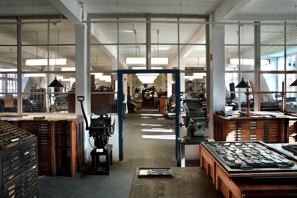
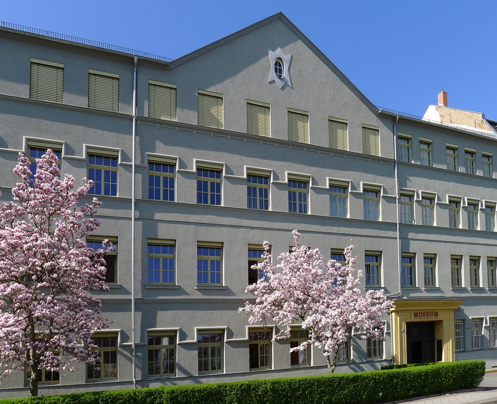
View into the Museum of the Printing Arts in Leipzig.
“Typography and Navigation” was the title of the 26th edition, which took place on June 5, 2021 at the Museum of the Printing Arts, Leipzig, and explored how typography makes it easier to find one's way around in everyday life, optimizes work processes, navigates the eye elegantly through texts or meets the changing demands of our world. Seven speakers from practice and research gave an insight into their projects and invited to a discussion.
The conference began with the obvious: Typography on maps. Jana Moser (Leibnitz Institute for Regional Geography, Leipzig) reported on the tightrope walk between conveying information and aesthetics. Maps often have to reproduce a large amount of information, whereby typography plays a decisive role and must not be neglected. Often it is only the typography that creates meaning as an explanatory element.
From the two-dimensional map to the three-dimensional space, Jay Rutherford (Bauhaus University Weimar) reported on a project with students in Ahmedabad, India. There, interdisciplinary approaches were tested, on the one hand to deal with non-existent signs and on the other hand to deal with sign forests in major Indian cities. The different regional languages of India represent an additional challenge, resulting in multilingual signs: Hindi, English and a regional language each with its own script. This aspect will play an increasingly important role in typography, as design increasingly functions internationally, i.e. has to adapt to regional writing systems and viewing habits.
In the contribution by Julian Jarosch (Academy of Sciences and Literature, Mainz), the focus was on the text itself. In his research, he deals with the eye movement when reading texts and the role that text typographic variables play in this. Specifically, he explained his experiments with fonts of equal thickness (non-proportional fonts), the influence of which on legibility and language processing he measured through eye tracking experiments. In doing so, he found that fonts of the same thickness lead to a cognitive adjustment in the recipient and that there are only minor effects on reading speed and text comprehension. Proportional fonts were recorded somewhat better by the test subjects. After a short adjustment, however, the eye can navigate successfully through the text in both font variants. However, the experiments are not yet complete.
It became very practical with Nico Wüst (Strichpunkt Design, Stuttgart), who presented various projects in the field of modular brand design. Modular and variable design is particularly interesting in the context of different output media and can optimize design processes. The topic of artificial intelligence will also play a growing role; although it cannot replace the designer, it can, however, support through certain standardizations.
Benjamin Schöndelen (Deutschlandradio, Berlin) designed the visual relaunch process of Deutschlandfunk Kultur and opened the participants' eyes to the connection between typography and radio. A radio is simply switched on less and less frequently, as more and more people are listening to the radio via mobile devices or consuming the program as a podcast regardless of the broadcast time. So there is an increasing need for navigation and visual representation. This was achieved on the one hand by simplifying the website structure, on the other hand by making micro-typographical adjustments. With the relaunch in November 2021, for example, the number of font styles used to date will be reduced. Adaptations in the code also ensure uniform quotation marks and apostrophes.
The focus of Claudia Friedrichs‘ (zweigrad Design, Hamburg) contribution was on the practical implementation and showed how strongly the respective context influences the design. Using two examples, she made it clear how important close contact with users is. Optimal functionality can only be achieved through compromises in design. Devices for use on construction sites must meet different requirements than those for private use indoors. Exactly what these are cannot be discussed alone at the desk, but needs to be supplemented with practical experience.
Finally, Nadya Kuzmina (Interface Designer, Berlin) talked about typography in video games and created a connection to the opening of the Typotage the evening before. Under the title “Typo-Play”, the Leipzig games collective “People Can Play” invited people to playfully deal with typography. The short lecture and a "Let's Play" are available on the Leipzig Typotage YouTube channel. Nadya Kuzmina deepened the topic in her lecture and made it clear that typography in video games is an underestimated field and offers a lot of space for experimentation.
The Leipziger Typotage are an event of the Gesellschaft zur Förderung der Druckkunst Leipzig e.V. (Society for the Promotion of the Art of Printing Leipzig e.V.), which has been taking place annually at the Museum of the Printing Arts, Leipzig, since 1995. In addition to type and typography, the conference also focuses on graphic design, art, production techniques in the print sector and related topics. It is about questions in an analogue and digital context with a view to history and innovative developments for the future. Practical examples, historical references and research results are discussed under an annually changing focus.
The Museum of the Printing Arts provides a unique setting for the conference. Historical, fully functional casting, setting and printing machines are located on four floors and are demonstrated daily. It is a lively industrial and cultural place that combines workshops and a museum and is dedicated to the intangible cultural heritage of printing techniques. Regular workshops also offer the opportunity to set and print texts yourself. Both beginners and more experienced “typesetters” will be happy with the rich stock of metal typesetting and with the support of the specialist staff. In doing so, some notice that the design of a text requires more than just putting together letters. Because typography is an art; it shapes information. The focus is always on legibility, because typography has a positive or negative influence on the conveyance of information. Today the term is broadly defined and extended to the design of communication media in general. The means of design are writing, images, lines, surfaces and empty spaces. Jan Tschichold once said: “Good typography is [...] there and yet not noticeable; inconspicuous, but a prerequisite for well-being, silent, supple [...] Good writing, correct arrangement; these are the two pillars of all writing.”
A distinction is made between macro and micro typography. Macro typography is about the overall design of a page, such as page format, type area, type of sentence, font size, line width or word separations. In addition, the placement of images or graphics, as well as the ratio of text to image, play a role. Microtypography is also called detailed typography and deals with the subtleties. It is about the choice of the font, the use of small caps (capital letters) or ligatures (letter combinations), the spacing of characters, words and lines as well as the spelling. While the first points leave a lot of creative leeway, there are clear rules for spelling, for example with regard to the format of quotation marks and dashes. Distances in particular have a major influence on reading speed and legibility. Narrow words and lines are more exhausting than an airy sentence in which the eye is guided clearly.
The most important design element in typography is font. The classification into 11 groups is common: Venetian Renaissance Antiqua, French Renaissance Antiqua (e.g. Garamond), Baroque Antiqua (e.g. Times), Neo-Classical Antiqua, Serif Linear Antiqua (also called Egyptienne), Sans serif Linear Antiqua (also Grotesk called, e.g. Helvetica), Antiqua variants, script fonts, handwritten Antiqua, broken fonts (e.g. Fraktur) and foreign fonts (e.g. Cyrillic). Both formal and historical criteria were used for the classification. The choice of font influences legibility and aesthetics and is based on the type of text and the font.
In the middle of the 15th century, Johannes Gutenberg not only developed printing with movable type, but also typography. With the first printed font, Textura, decisions about letter shapes, spacing or highlighting were also necessary. These were considerations that were also relevant for handwriting, but were handled individually. The work of the prototypographers - as the typographers of the first generation in the 15th century were called - was refined over the following centuries. Typographic systems of measurement and terms, which for the most part developed between the 17th and 19th centuries, are still used today, also in a digital context. The point as a measure of font size, for example, goes back to the French François Ambroise and Firmin Didot. At the end of the 18th century they defined a point of 0.376 millimeters, which German type foundries also used as a guide. In addition to the French point, there was also the American point and, with the introduction of desktop publishing in the 1980s, the PostScript point, which is also used by today's word processing programs. Many of the fonts used today also have their origins in lead type. The Times, for example, was designed in 1931 for the magazine "The Times", and the Futura font was designed in 1927 by Paul Renner. Both are timeless fonts that are still used today alongside many others such as Garamond, Bodoni or Walbaum. The widening of the character spacing, the “spacing”, also comes from hand typesetting. Spaces are narrow strips of metal that create space. If you take a closer look at type and hand typesetting, you will repeatedly come across terms that we today mostly use in digital handling of type without knowing their origin.
One of the greatest challenges in digital design with text are the different output devices. The contents are no longer unchangeable, as in the printed book, but adapt to different formats. This variability must be taken into account from the outset so that content communication works in different types of display.
Type is ubiquitous, good typography is not. However, it is a prerequisite for text to be read and understood with ease. So what is good typography? That clearly depends on the evaluation framework and changes with the zeitgeist. In any case, content and form must be in a meaningful relationship to one another. The form must serve the content, which allows different interpretations, but is condensed in the principle “Form follows function”. But like many other things, typography not only requires following rules, but above all practice.
The 27th edition of Leipziger Typotage will take place in the spring of 2022 at the Museum of the Printing Arts and online.
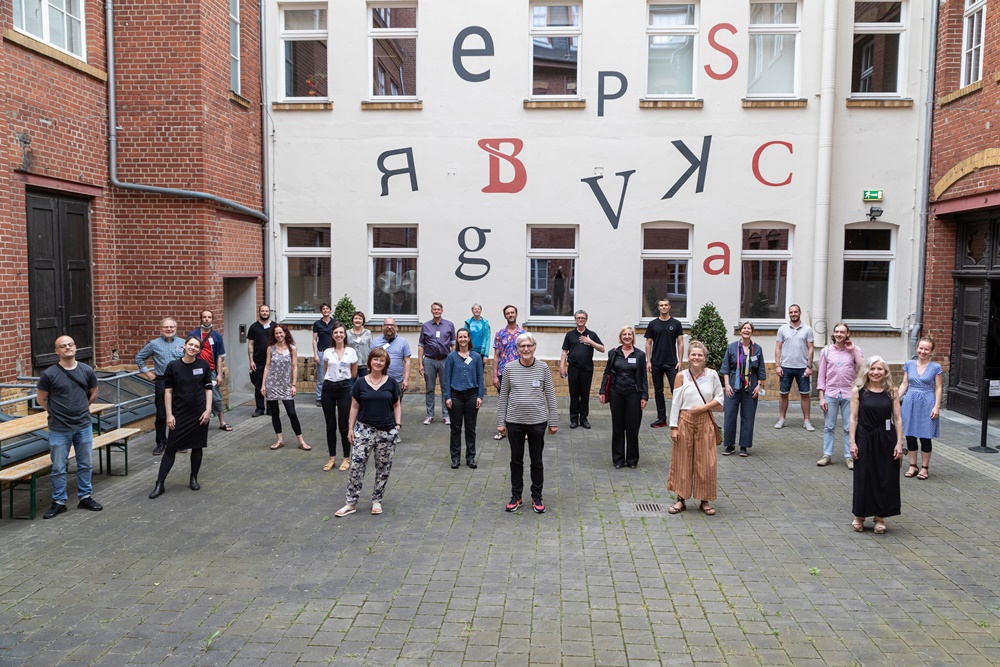
The participants of the 26th Leipzig Typotage.
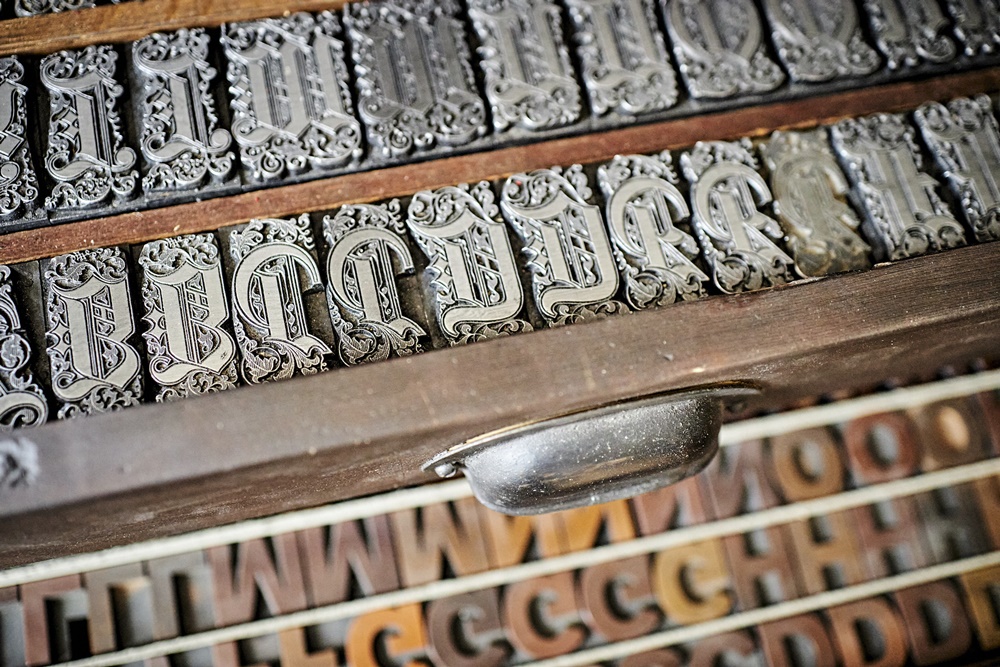
Letters from the museum collection.
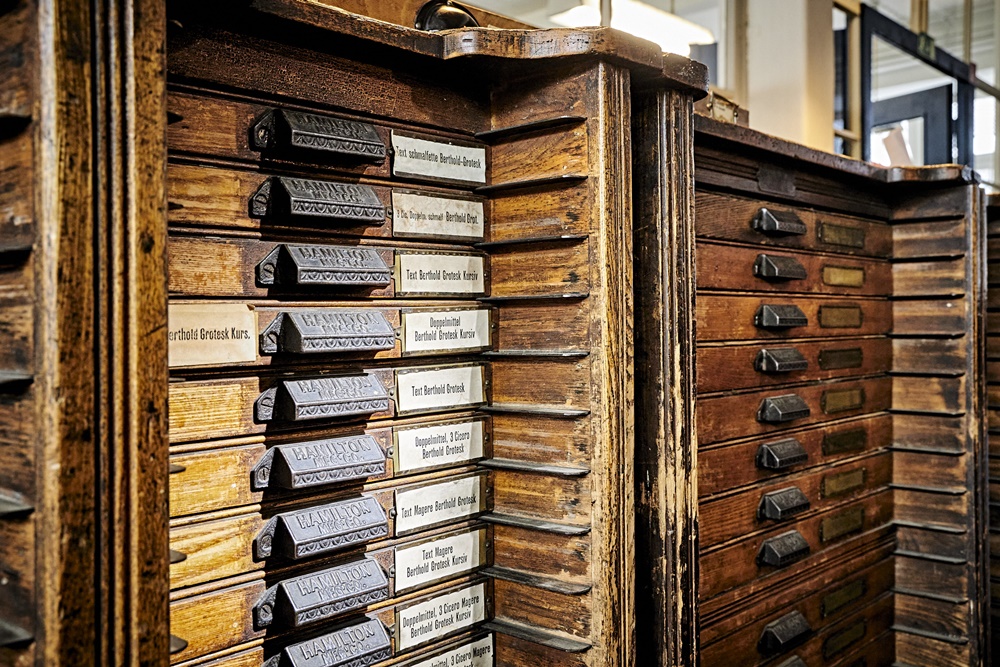
Set cabinets in the small press room.
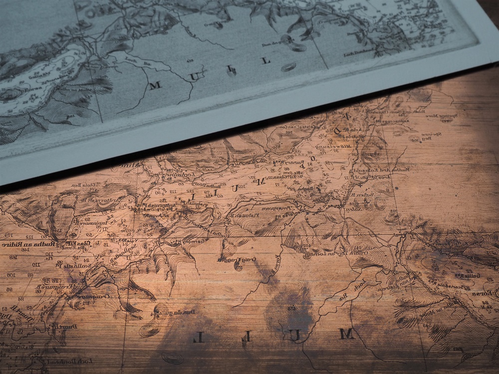
Printing plate for map printing in gravure printing.
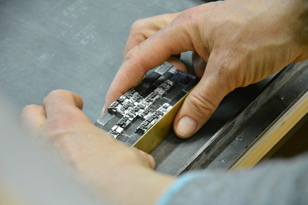
Letterpress workshop at the Museum of the Printing Arts (1).
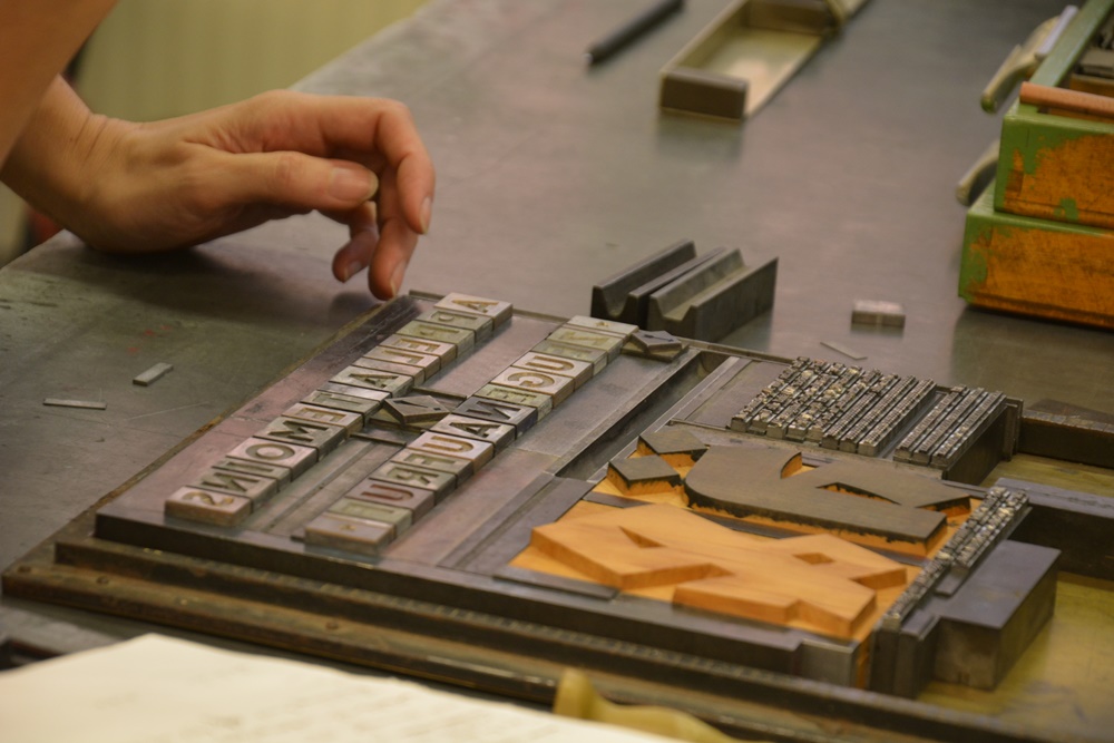
Letterpress workshop at the Museum of the Printing Arts (2).
The Museum of the Printing Arts, Leipzig.
Author: Almut Hertel (Museum of Printing Arts, Leipzig)
Images: Klaus-D. Sonntag [1-2], Michael Jungblut [3-4], Museum für Druckkunst [5-8]
